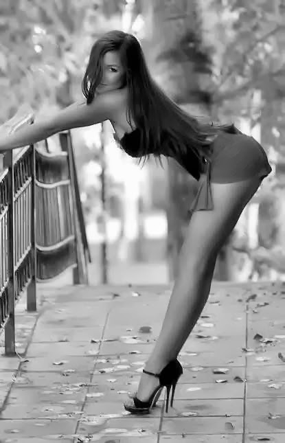
 When I found this photo I was going to publish it with a remark, that this girl definitely looks happier (see It’s all about eyes, isn’t it?). Besides it’s just a great contemporary pin-up image with a beautiful girl in high-heels and a hint of pantyhose.
But then I’ve found another photo (see below). What do you think? 😉


Black and white – it’s more “classy” to me.
I love colour, but sometimes the black and white image works better because you ‘imagine’ the colours yourself.
The photos above are a classic example – in the B&W I’ve imagined the girl in totally different colours to the actual ones she’s wearing. So the B&W image is more appealing than the colour one.
MJ
In this particular example I would say, that the colours distract from the actual subject. The accent is moved to the red skirt/shorts, what is wrong (unless it’s intended for some strange reasons). Also, B&W provides better foreground/background separation. Plus different framing.